Sunday, 28 June 2015

Experiment 3


Mash-up


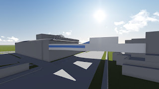
The proposal of a rich new life, designed as a “highly sustainable” where the design will bring longevity and depth to the community; to set a new standard for architectural ambition in the area and stimulate further urban development. This forges an innovative model of green development in which people enjoy space filled with natural light and comfortable wind, and many plants allowing them to enjoy life.

A performance-driven design public building that would embody a unique variety of civic nodes and public spaces. Inside and outside are connected more gently by colour and light which combine and illuminate, creating a bright and uplifting interior atmosphere, no matter the weather. Mitigating solar heat gain throughout the year through use of exterior sun shades, will dramatically improve the workplace environment and save energy by reducing the need for artificial lighting in the office interiors.

Taking advantage of the prevailing winds and increased wind speeds at the upper floors to generate energy, along with naturally ventilating the building will make it designed to minimise energy usage. Its presence will stand as a model of sustainability and efficiency, as well as collaborative workplace design all the while presenting us the value beyond current designs for long term future requirements.


18 Perspective Sketches


12 One Point Perspectives


6 Two Point Perspectives


36 Movement Textures


4 Real Time Draft Captures


Zaha Hadid - Irish Prime Ministers House


Plan


Sectioned Rooms


Two Moving Elements In Still Pictures


Light sensors rotate solar panels to face the sun for optimal energy gain.


Wind sensors open and close wind barriers to allow for a counter clockwise rotation of wind within the area to maximise natural ventilation in the building via wind turbines.


Two Student Assessments


Five Final Image Captures

Solar and wind energy designs to maximise sustainability and resource usage in preparation for long term profit where there is more energy saving as becoming an environmentally friendly design for those to aspire to create for future designs.

Connecting people, space and light via allowing light to pass through the design onto the road space underneath which in future will be space in which a tram runs allowing for travellers to have natural light to guide their path. Windows also surround the design allowing light to enter the building gently around it decreasing the need for man-made lights as the design will usually for the majority of the time be used during the day.

Minimalistic lecture room set-ups for small student numbers of around 100 to reduce need of redundant decorations or extra unneeded elements that are present in lecture rooms.

Simplicity in library and computer rooms for ease of research for small scale needs without need for extra forms of distraction or obstructions when learning.

Walkways allowing one to travel from the square house to NIDA all the while observing the gallery on one side of the wall and the busy city roads through the windows on the other wall. This also allows natural light to enter the building on both sides as there are walkways on both sides of the design.

Drop-box, Warehouse Link


Monday, 4 May 2015

Experiment 2


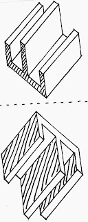
Concept Axonometric : 6 pairs


Peter : Mixing of formality and informality to create blurred spaces and framing of environment.


Peter : Thin material utilisation to reduce the distinction between natural and constructed worlds.


Peter : The effects of time and natural light and their creation of shadows to create a play of natural lighting.


Kazuo : Illogical movement made by illogical shape placement resulting in buildings looking like artworks.


Kazuo : Illusionary large spaces in buildings via use of high walls and standing out singular elements seen from the ground floor.


Kazuo : Appreciation and recognition of structured chaos to create and represent progressive anarchy.


Concept: Structured Chaos by Kazuo Shinohara


2 Lumion Images


Parallel Projections : 3 pairs


Peter : The effects of time and natural light and their creation of shadows to create a play of natural lighting.
Kazuo : Illusionary large spaces in buildings via use of high walls and standing out singular elements seen from the ground floor.


Peter : Mixing of formality and informality to create blurred spaces and framing of environment.
Kazuo : Appreciation and recognition of structured chaos to create and represent progressive anarchy.


Peter : Thin material utilisation to reduce the distinction between natural and constructed worlds.
Kazuo : Illogical movement made by illogical shape placement resulting in buildings looking like artworks.

Concept: Blurring (Peter) + Illogical (Kazuo)


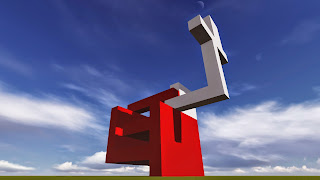
Electro-liquid Aggregation : The blurring of spaces between the illogical placement of structures produces an artwork that creates a flowing movement that creates a framing of interior and exterior components


2 Lumion Images With One Curvature Image


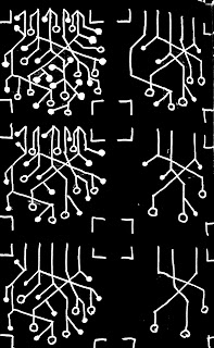
36 Custom Textures : Light And Dark


Starting with lightness at top left going down then back to top right and back down to darkness.


Sustainability - Connection of natural world and relationships


Sustainability - Intertwining balance of world and people


Multicultural - Aboriginal circular symbol for equality


Multicultural - Aboriginal art form of lines through a dominant image, connection between main and branch communities


Technology - Development on top of what is already made


Technology - Symbolism of networking seen in people and machines

3 Chosen Textures


5 Lumion Images of Final - Short Comments (40 Word Limit)


Electro-liquid Aggregation : The blurring of spaces between the illogical placement of structures produces an artwork that creates a flowing movement that creates a framing of interior and exterior components


The marker has been designed purposely to be large and direct so that observers know that it is a marker as well as observe its details in full. Due to this, the marker is not scalable by all audiences.


The marker does not present a strong sense of space at first glance, it actually tends to confuse and misdirect our sense of space (blurring) however it still keeps a framing of the environment and lighting when viewed from different angles (framing).


 The marker shows continuous connectivity between multiculturalism prevailing on top while technology supports it with sustainability always on the side and growing represented by the increasing platform next to the marker.


 The marker is cantilevered with a rising platform as a symbolic form of sustainability to the environment through the minimal use of land while the markers shadow creates a shadow of the coiled rainbow snake (creator god) from Aboriginal stories.


The advancement of technology allows for the marker to obscenely be shown in a sustainable environment which seems like it cannot be built upon, this represents the multicultural bypassing of the community as they connect and become one.

Links


Dropbox

3D Warehouse